Custom Gauge Card — Home Assistant card
Animated circular LED gauge for Home Assistant: colored zones, markers, visual alarms, trend and control buttons.
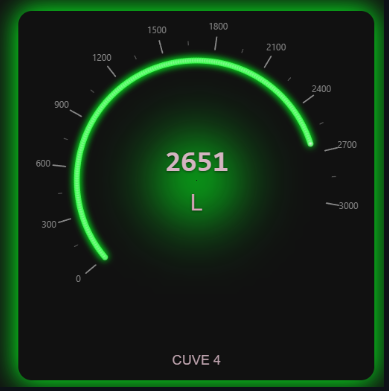
Overview
Custom Gauge Card shows a Home Assistant sensor as a circular gauge made of animated LEDs. The arc, scale ticks, colored zones and markers are fully adjustable, from a full circle to a C-shaped gauge, with a bidirectional mode for negative values.
The card flags out-of-range values with visual alarms triggered by any entity, shows the 24-hour trend, and can control up to four entities (lights, switches, scenes, scripts) from buttons placed under the title.
Features
- Circular gauge with animated LEDs
- Smooth and fluid value transitions
- Dynamic shadow and lighting effects
- Multi-entity alarms with four visual effects (pulsating shadow, blinking LEDs, blinking value, pulsating card border)
- Bidirectional display for thermometer-style visualization with negative values
- Customizable themes (light, dark, custom)
- Configurable arc span and start angle (arc_sweep, arc_start)
- SVG scale overlay with major/minor ticks and value labels (scale_ticks)
- Define colored zones to visualize value ranges
- Add static markers with labels for specific reference points
- Dynamic markers that follow entity values in real-time
- Flexible color and opacity configuration
- Full support for bidirectional mode
- Evolution over 24 hours (or any period)
- Percentage or absolute change with directional arrow
Installation
- In Home Assistant, open HACS (“Open in HACS” button above), add the guiohm79/custom-gauge-card repository if asked, then install “Custom Gauge Card” and reload your browser.
- Without HACS: download custom-gauge-card.js from the latest GitHub release, copy it to config/www/, then add the resource /local/custom-gauge-card.js (type “JavaScript module”) in Settings → Dashboards → Resources.
Configuration
type: 'custom:custom-gauge-card'
entity: sensor.processor_use
min: 0
max: 100
title: Processor
Options
| Option | Type | Default | Description |
|---|---|---|---|
entity (required) | string | Entity to display | |
attribute | string | Attribute of the entity to display instead of its state (e.g. current_temperature) | |
name | string | Name displayed below the gauge | |
unit | string | Unit of measurement | |
min | number | 0 | Minimum value |
max | number | 100 | Maximum value |
decimals | number | 0 | Number of decimal places |
gauge_size | number | 200 | Gauge size in pixels |
center_size | number | 120 | Center size in pixels |
led_size | number | 8 | LED size in pixels (diameter; for rect, the segment width along the arc) |
led_shape | string | round | v2.4: round (LEDs) or rect (radial segments, hi-fi VU meter style) |
led_length | number | led_size × 2 | v2.4: rect only — radial length of the segments in pixels. Segments grow inward: their outer edge stays where round LEDs sit |
led_corner_radius | number | 1 | v2.4: rect only — corner rounding in pixels |
leds_count | number | 100 | Number of LEDs |
bidirectional | boolean | false | Enable bidirectional display (thermometer-style for negative values) |
bidirectional_reference | number | auto | v2.5: Bidirectional only — value the LEDs grow from, in the sensor unit. Default: 0 when it lies between min and max, otherwise the midpoint. Clamped to [min, max] |
card_width | string | auto | Width of the card container (e.g. "300px") |
card_height | string | auto | Height of the card container (e.g. "350px") |
card_padding | string | 16px | Padding of the card container |
theme | string | default | Theme: default, light, dark, custom |
custom_background | string | Background color (custom theme) | |
custom_gauge_background | string | Gauge background (custom theme) | |
custom_center_background | string | Center background (custom theme) | |
custom_text_color | string | Text color (custom theme) | |
custom_secondary_text_color | string | Secondary text color (custom theme) | |
title_font_family | string | inherit | Font family for the title (e.g., "Roboto, Arial, sans-serif") |
title_font_size | string | 16px | Font size for the title |
title_font_weight | string | normal | Font weight for the title (e.g., "normal", "bold", "600") |
title_font_color | string | Custom color for the title (overrides theme color) | |
value_font_family | string | inherit | Font family for the center value (e.g., "Roboto, Arial, sans-serif") |
value_font_size | string | 32px | Font size for the center value |
value_font_weight | string/number | bold | Font weight for the center value (e.g., "normal", "bold", 300-900) |
value_font_color | string | Custom color for the center value (overrides theme color) | |
unit_font_size | string | 16px | Font size for the unit symbol |
unit_font_weight | string/number | normal | Font weight for the unit (e.g., "normal", "bold", 300-900) |
unit_font_color | string | Custom color for the unit (overrides theme secondary color) | |
arc_sweep | number | 360 | Arc span in degrees (30–360). Use values below 360 for a partial gauge (e.g. 270 for a C-shape) |
arc_start | number | 0 | Start angle in degrees from the top/12 o'clock position, clockwise |
scale_ticks | boolean | false | Show SVG graduation overlay on the gauge |
scale_steps | number | 5 | Number of major tick intervals |
scale_labels | boolean | true | Show value labels at each tick |
tap_action | object | {action: more-info} | Configurable click behavior |
smooth_transitions | boolean | true | Enable smooth transitions |
animation_duration | number | 800 | Animation duration in ms |
enable_shadow | boolean | false | Enable outer shadow |
center_shadow | boolean | false | Enable center shadow |
center_shadow_blur | number | 30 | Center shadow blur |
center_shadow_spread | number | 15 | Center shadow spread |
center_shadow_pulse | boolean | false | Deprecated in v2.2 — see Alarms. Enable pulsation alarm on center shadow |
center_shadow_pulse_duration | number | 1000 | Deprecated. Duration of one complete pulsation cycle in ms |
center_shadow_pulse_min | number | min | Deprecated. Minimum value of alarm zone (uses real sensor values, not percentages) |
center_shadow_pulse_max | number | max | Deprecated. Maximum value of alarm zone (uses real sensor values, not percentages) |
center_shadow_pulse_intensity | number | 0.5 | Deprecated. Minimum intensity during pulsation (0-1) |
condition | string | range | See the condition table below |
min / max | number | gauge min/max | Bounds for range and outside |
value | number | 0 | Threshold for above, below, equal |
state | string | on | Compared string for state and state_not |
effect | string | shadow_pulse | See the effect table below |
color | string | severity color | Alarm color — ignored by leds_blink |
duration | number | 1000 | One full cycle, in ms (minimum 100) |
intensity | number | 0.5 | Trough of the cycle, 0 = full flash, 1 = no visible pulse |
transparent_card_background | boolean | false | Make the main card background transparent |
transparent_gauge_background | boolean | false | Make the gauge circle background transparent |
transparent_center_background | boolean | false | Make the center circle background transparent |
hide_shadows | boolean | false | Hide all box-shadows |
hide_inactive_leds | boolean | false | Hide inactive (gray) LEDs, showing only active LEDs |
show_trend | boolean | false | Show the trend indicator (change over trend_hours) |
trend_mode | string | percent | v2.5: percent (relative change) or absolute (change in the sensor unit, e.g. ↑ 0.6 °C). A relative change from 0 always falls back to absolute |
trend_position | string | bottom-right | v2.5: bottom-right, bottom-left, top-right, top-left or below-title (in the card flow, between the title and the button bar — never overlaps) |
trend_hours | number | 24 | v2.5: Length of the trend window, in hours |
trend_update_interval | number | 300 | v2.5: How often the start-of-window value is re-read from the history, in seconds (minimum 60). 0 reads it once, like before 2.5. The current value is always the live one |
trend_show_period | boolean | false | v2.5: Show the period (24 h) next to the variation |
trend_font_size | string | 12px | v2.5: Font size of the indicator |
trend_background | string | rgba(0,0,0,.6) | v2.5: Background of the indicator (any CSS value, e.g. transparent) |
trend_up_color / trend_down_color / trend_stable_color | string | #4caf50 / #f44336 / #ffeb3b | v2.5: Arrow colors. "Stable" means the change rounds to zero at the displayed precision |
button_icon_size | number | 22 | Default icon size for all buttons (in pixels) |
buttons_layout | string | bar | bar (under the title) or corners (pre-2.3 placement, honors each button's position) |
markers | list | List of static markers with value, color, label (uses real sensor values) | |
dynamic_markers | list | List of dynamic markers that follow entity values | |
zones | list | List of zones with from, to, color, opacity (uses real sensor values) | |
severity | list | UPDATED: List of thresholds with value, color for LEDs (uses real sensor values, not percentages) | |
severity_mode | string | v2.4: steps (default) — one flat color per zone; gradient — the whole bar takes one color, blended in RGB between the two thresholds around the current value; gradient_arc — each LED takes the color of its own position, so the lit part shows the full gradient | |
power_save_mode | boolean | false | Pause updates when invisible |
power_save_threshold | number | 10 | Visibility threshold (%) |
update_interval | number | 1000 | Update interval in ms |
debounce_updates | boolean | false | Limit update frequency |
FAQ
How do I install Custom Gauge Card?
With HACS: add https://github.com/guiohm79/custom-gauge-card as a custom repository (Dashboard / Lovelace category), install the card, then reload your browser. The “Open in HACS” button on this page adds the repository for you. Home Assistant 2024.1 or newer is required.
Do I need to write YAML?
No. The card has a full visual editor with collapsible sections for every setting. YAML is still available to copy a configuration from one dashboard to another.
Can the gauge show negative values?
Yes: with bidirectional: true, the gauge starts from zero and lights up on either side, like a thermometer.
Can a visual alarm be triggered by another entity?
Yes. Alarms accept any entity and four effects: pulsating shadow, blinking LEDs, blinking value or pulsating card border.